When it comes to running a business, your logo is often the first thing people notice. It’s your visual handshake, a symbol that tells the world who you are and what you stand for. But designing a logo can feel like a daunting task—especially when you want it to be memorable, professional, and unique. Here are some practical tips to help you create a logo that really works for your business.
Understand Your Brand
Before you even think about shapes, fonts, or colours, take a moment to reflect on your brand. Ask yourself: what message do I want to convey? What values does my business embody? For instance, a bakery specialising in rustic sourdough might lean towards earthy tones and handcrafted elements, while a tech startup might opt for clean lines and bold, futuristic fonts.
Your logo should capture the essence of your business, so the more clarity you have about your brand’s personality, the easier it will be to design something meaningful.
Keep It Simple
Simplicity is key when it comes to logos. Think about the logos you remember most—Apple, Nike, McDonald’s. They all share a clean, straightforward design that’s instantly recognisable. A complicated logo with too many elements can overwhelm the viewer and lose its impact.
Stick to one or two strong ideas and let them shine. A minimalist approach not only looks polished but also ensures your logo works across different platforms, whether it’s on a website, business card, or billboard.
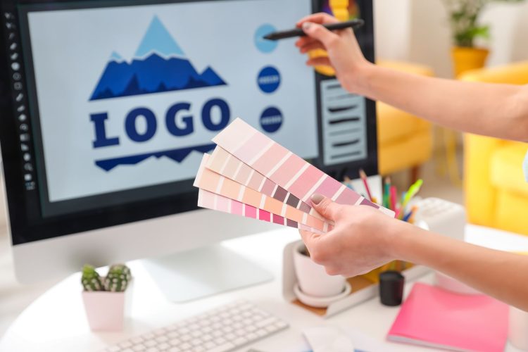
Choose Colours Wisely
Colours play a huge role in how people perceive your brand. Each colour evokes a different emotion or association—blue often conveys trust and professionalism, while red is bold and energising. Think about how you want customers to feel when they see your logo.
Remember, less is more here too. A good rule of thumb is to stick to two or three main colours. Too many can look chaotic and be harder to reproduce consistently.
Get the Typography Right
The right typeface can make or break a logo. Are you aiming for something playful, elegant, or modern? Serif fonts often feel traditional and sophisticated, while sans-serif fonts are clean and contemporary. Script fonts can add a personal or luxurious touch but be cautious—they can sometimes be difficult to read.
Whichever typeface you choose, ensure it’s legible and matches the tone of your business. A quirky font might suit a children’s toy shop but would feel out of place for a law firm.
Make It Versatile
A logo should look just as good on a tiny social media icon as it does on a giant banner. When designing, think about how your logo will adapt to different sizes and formats. A detailed illustration might look stunning on a large scale but could lose its clarity when scaled down.
Creating a version of your logo in black and white is also a smart move—it ensures it will still look great in situations where colour printing isn’t an option.
Get Feedback
Once you’ve come up with a few ideas, share them with people you trust. Ask for honest feedback and pay attention to how others interpret the design. What emotions does it evoke? Is it memorable? Sometimes, an outside perspective can highlight things you may have overlooked.
Be open to tweaking your design based on constructive criticism. It’s all part of the process.
Don’t Be Afraid to Ask for Help
If you’re struggling to bring your vision to life, consider hiring a professional graphic designer. They can help translate your ideas into a polished design while ensuring the technical details—like colour matching and file formats—are spot on.
While it’s an investment, a well-designed logo is worth it. After all, it’s going to represent your business for years to come.
Creating a logo that truly works for your business doesn’t have to be overwhelming. By understanding your brand, keeping things simple, and being thoughtful about colours and typography, you’re well on your way to designing something you can be proud of. Remember, a good logo isn’t just about looking nice—it’s about telling your story in a way that sticks with people.
Comments
Solid advice on getting feedback. It’s easy to get too attached to your own ideas, but having fresh eyes on a design makes all the difference. Good reminder.
In commodo luctus metus, vel auctor metus luctus in, class aptent taciti sociosqu ad litora torquent per conubia nostra, per inceptos himenaeos aliquam dapibus lobortis ligula.
Spot on about colour choices. I hadn’t thought much about how colours affect perception, but it’s obvious once you hear it. Definitely something to keep in mind for my next project.